Assignment Description
Your assignment is to create a magazine cover using either Photoshop or InDesign.
Look at the examples of magazine covers below and notice the difference in styles among different magazines. •
This cover will eventually be used as a cover for your YOURbook project, so it should act both as a functional magazine cover, but also represent you and your time in school this year.
Look at the examples of magazine covers below and notice the difference in styles among different magazines. •
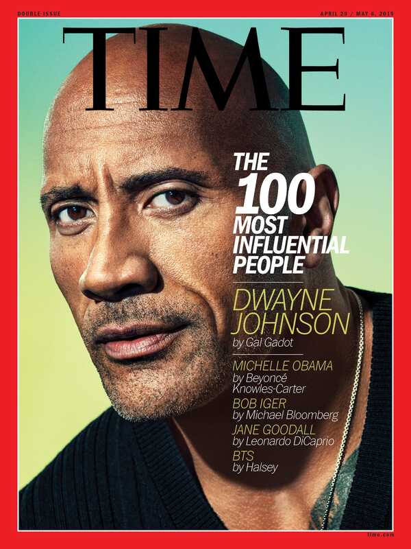
- Time Magazine uses a very simple and clean magazine cover style o It features a picture and usually only discusses one main story of the magazine •
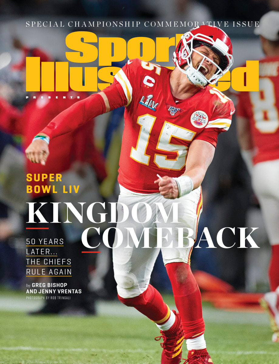
- Sports Illustrated always utilizes a picture of an athlete on their cover (Except the swimsuit editions) o Features one picture with a main story but also discusses other stories that might draw a reader in •
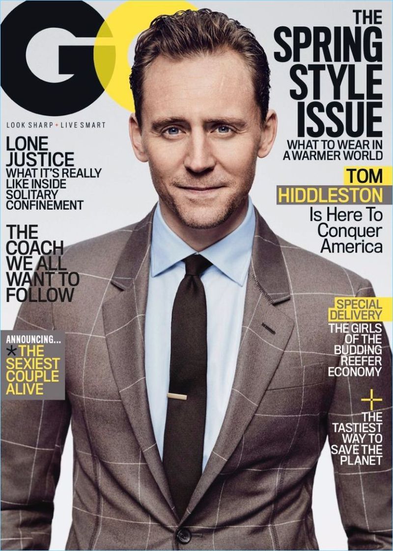
- GQ is a men’s’ lifestyle and fashion magazine o Usually the cover features a picture of a well-dressed man that people would be interested in reading about •
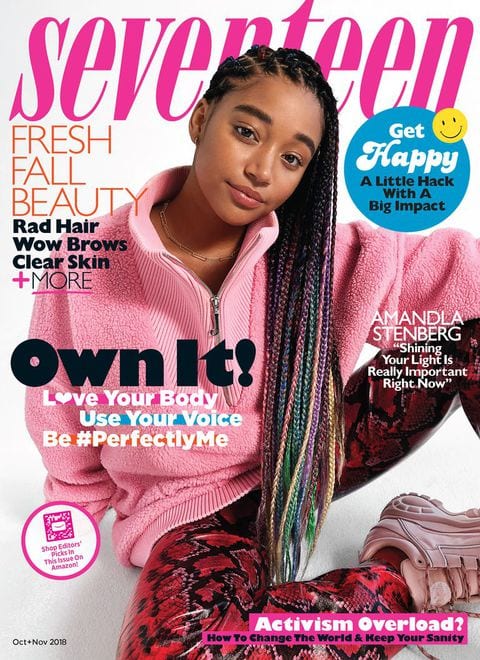
- Seventeen is the one of the busiest magazine covers o Seventeen is geared toward teenage girls so they are trying to grab their attention o Notice there are many different colors and font styles and the articles are geared toward teenaged girls •
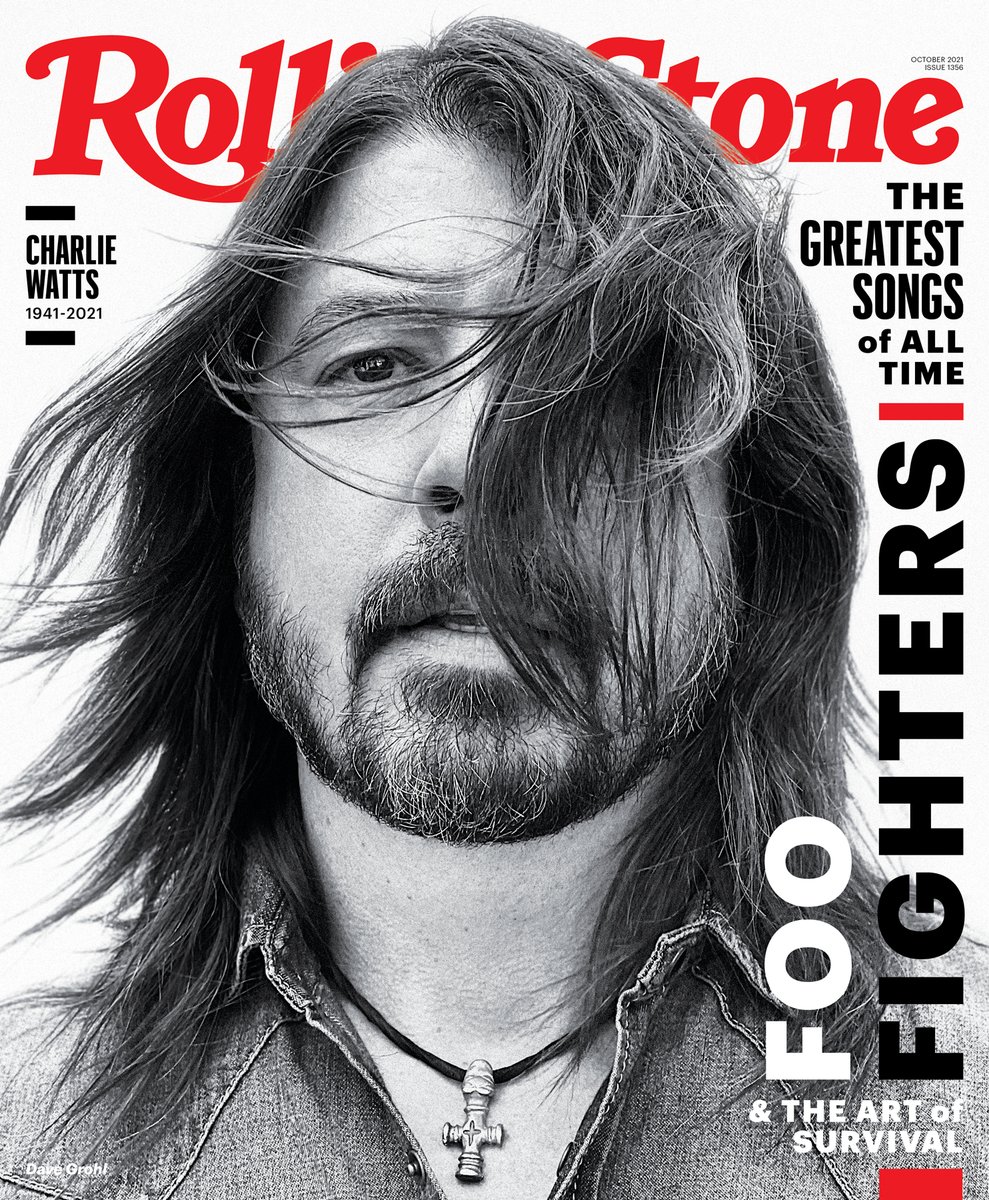
- Features one main picture, but can be a collage, mostly closeups of a person.
- All text is placed in a way that interacts with or doesn't take focus from picture
- All text is readable and colors of text is appropriate to the magazine
- All covers use boxes, lines, frames, circles or other design elements to enhance look.
This cover will eventually be used as a cover for your YOURbook project, so it should act both as a functional magazine cover, but also represent you and your time in school this year.
- Make sure that everything is laid out neat and organized on your magazine cover.
- Make sure everything on your magazine cover is appropriate for school
- You can use either Photoshop or InDesign for this project

Assignment Resources
|
|
|
Assignment Rubric
- Photography: Image and placement follows strong design principles and tremendously aids to the ad's effectiveness.
- Typography: Typography is used effectively, and greatly enhances the stylistic aspect of the overall layout as well as the readability of the layout. The Headline speaks directly to the target audience.
- Design: Clear Hierarchy of text (at least 3 levels present). Use of other graphic elements (lines, frames, boxes, etc.) to add color and interest to the page.